Graphic design portfolio / vintage fashion visuals / garment-first direction
S8INTSHILL
A clean portfolio with more soul. Built around washed, distressed, vintage-leaning graphics that feel designed for clothing first — not just screens. The strongest work lives at the top: pieces that actually made it off the mockup and into the world.
Structured to show taste, texture, and execution. First the finished pieces, then the mockups, then the wider design language behind them.
Priority Section
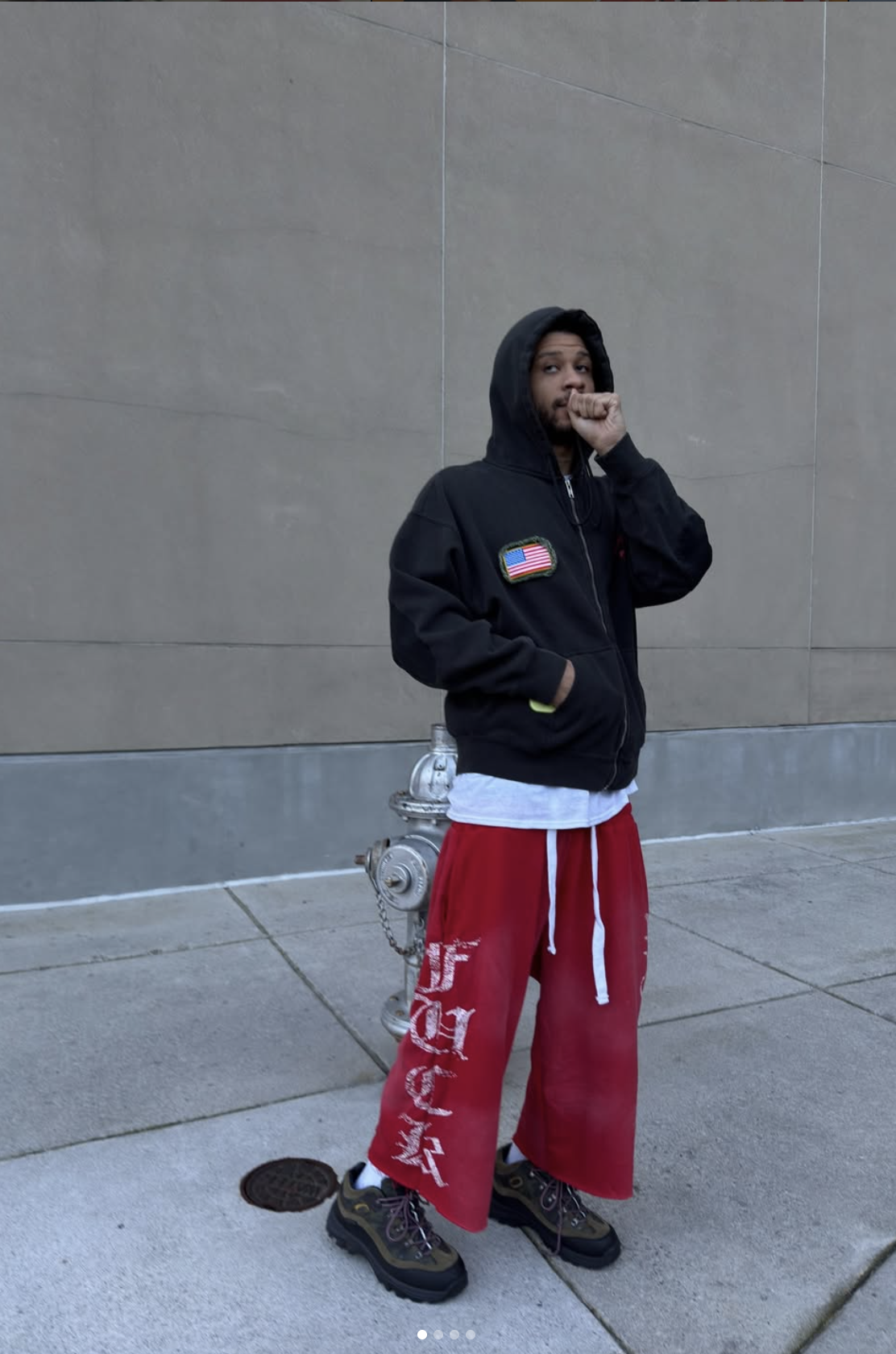
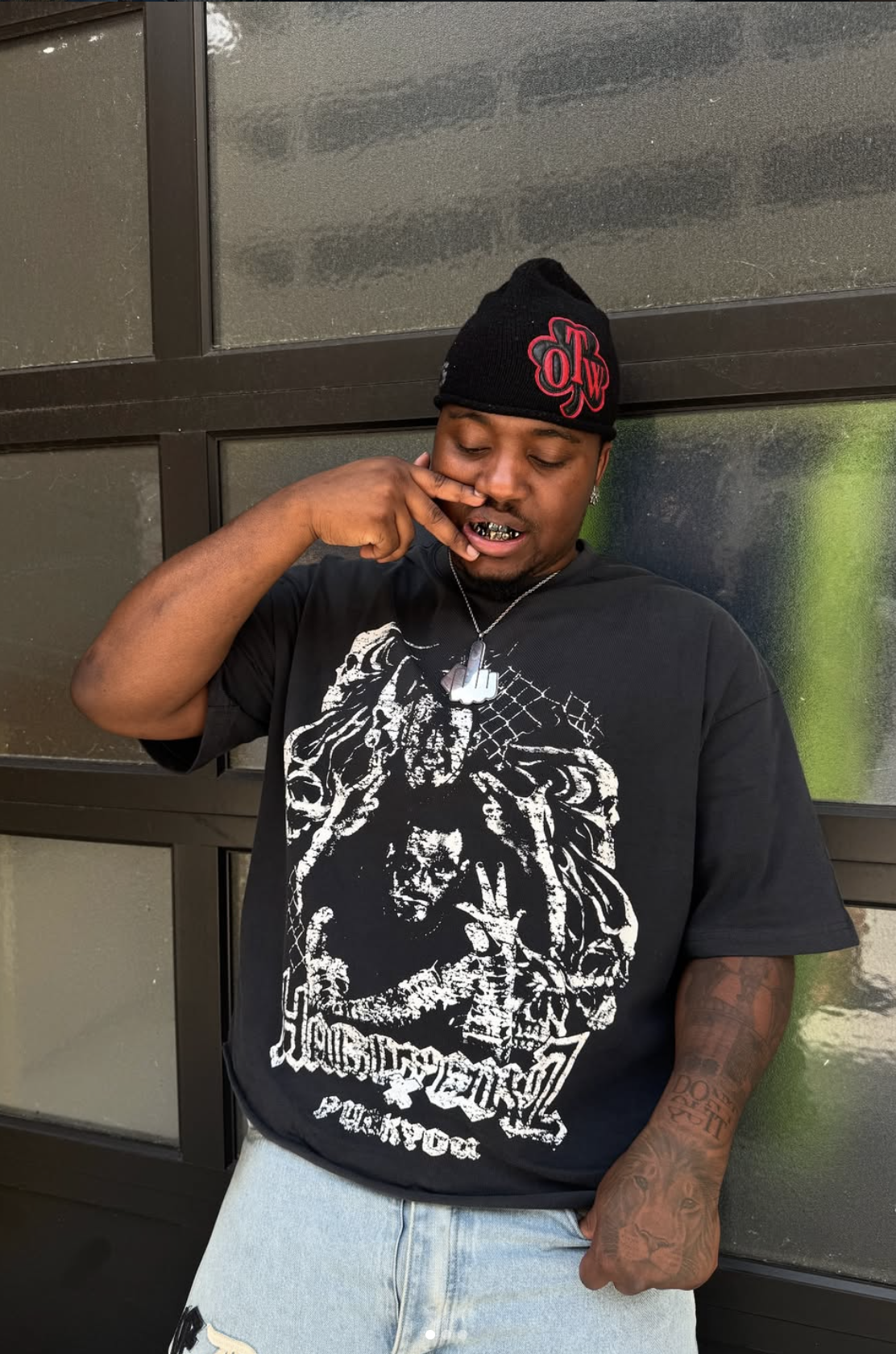
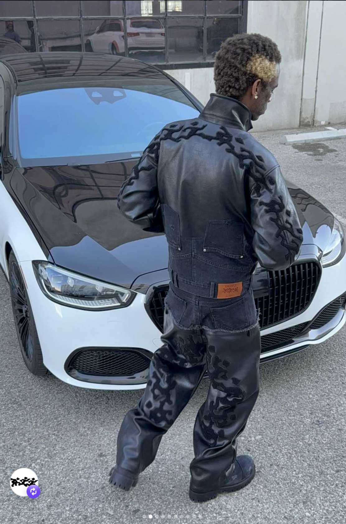
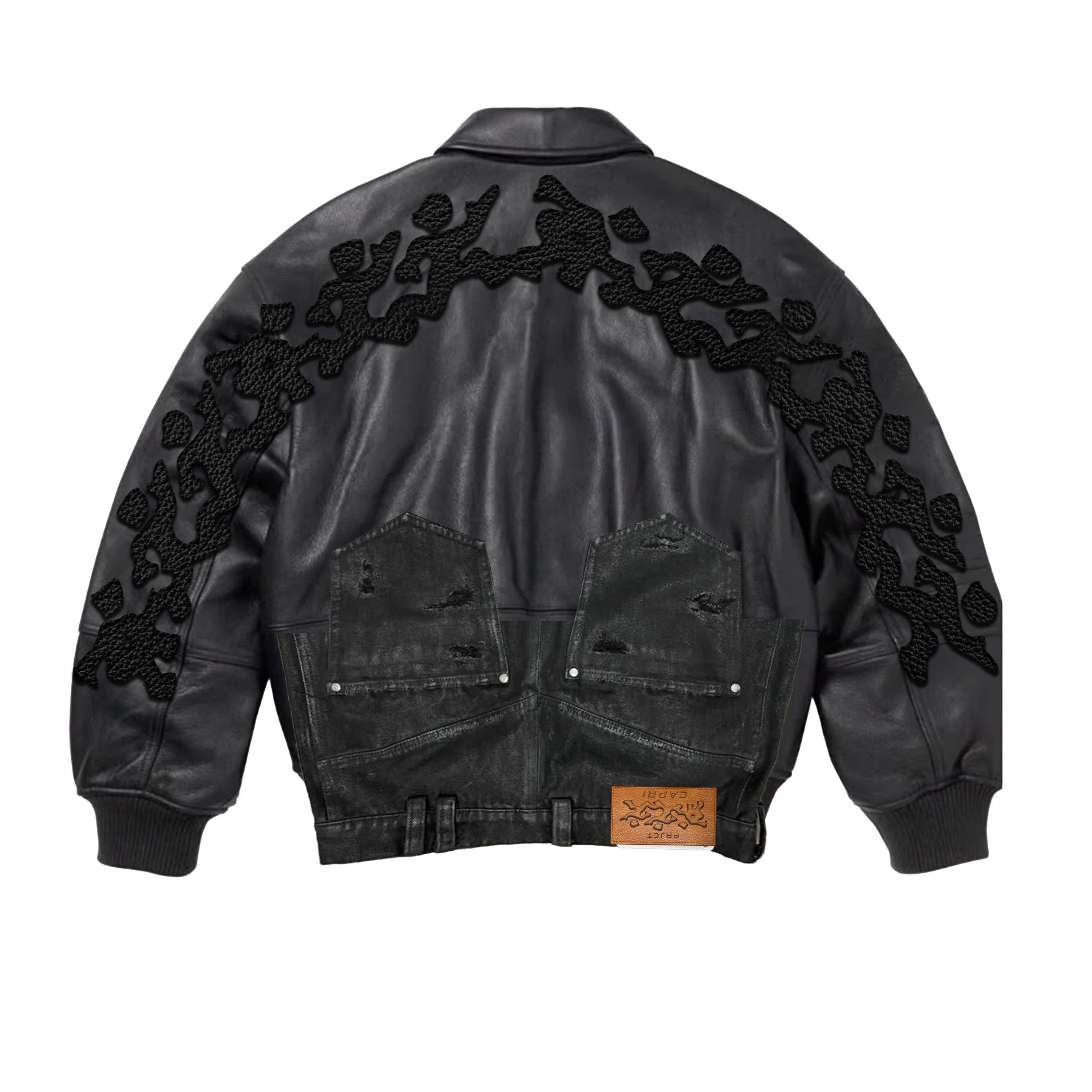
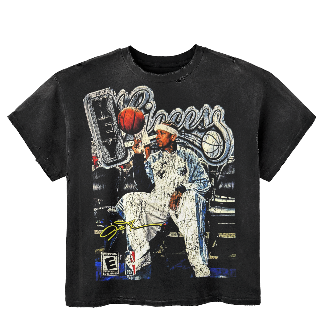
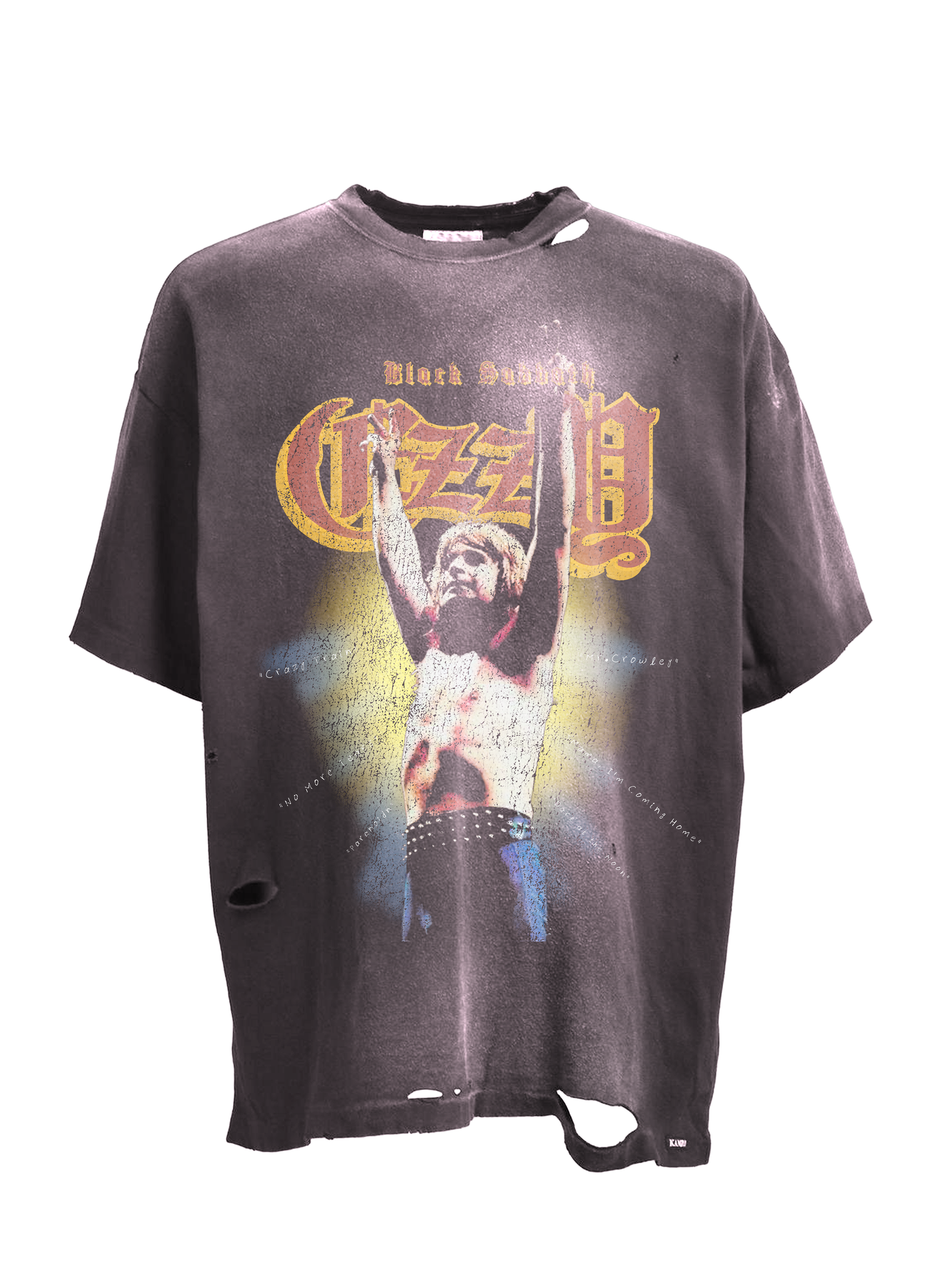
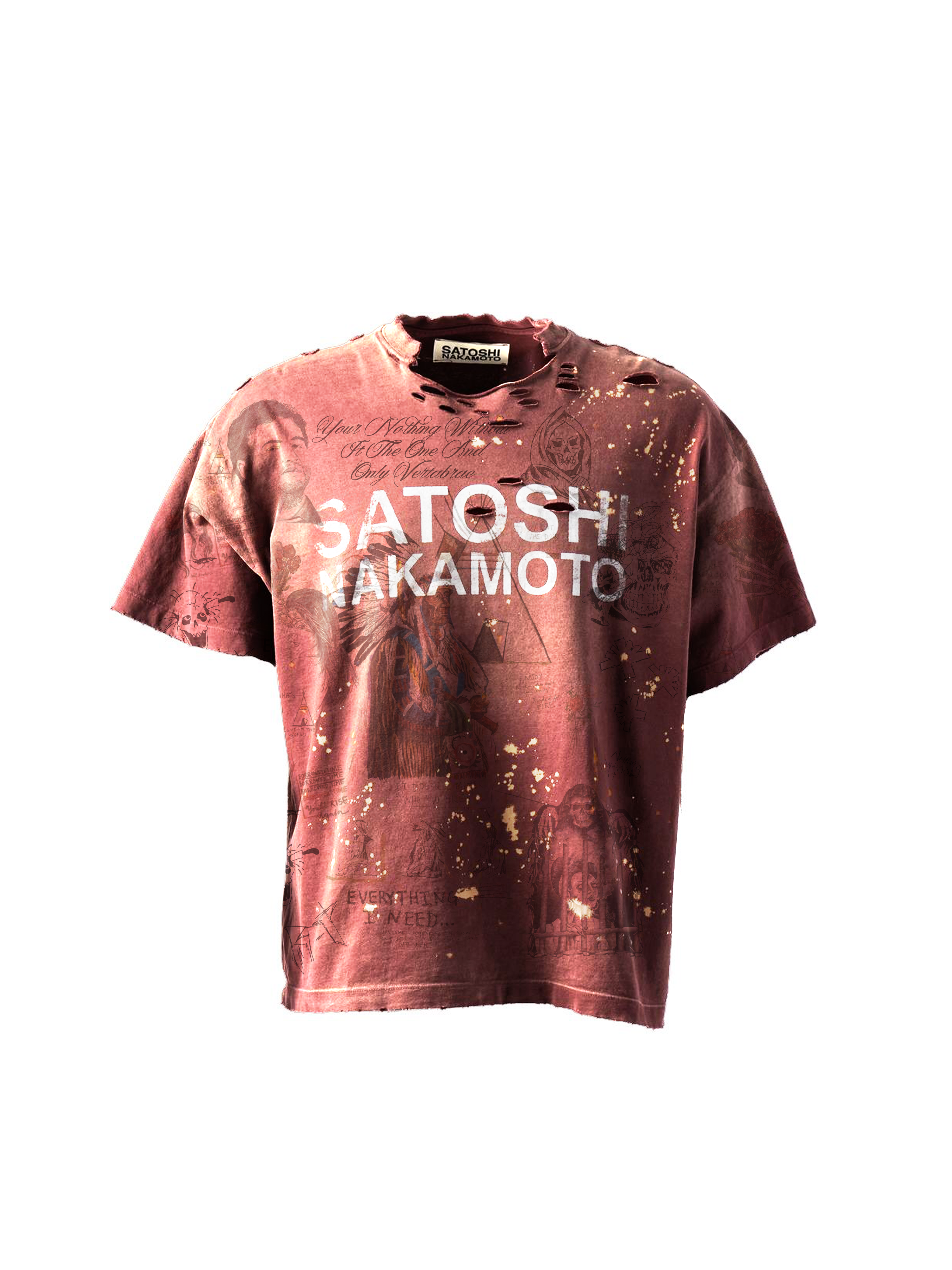
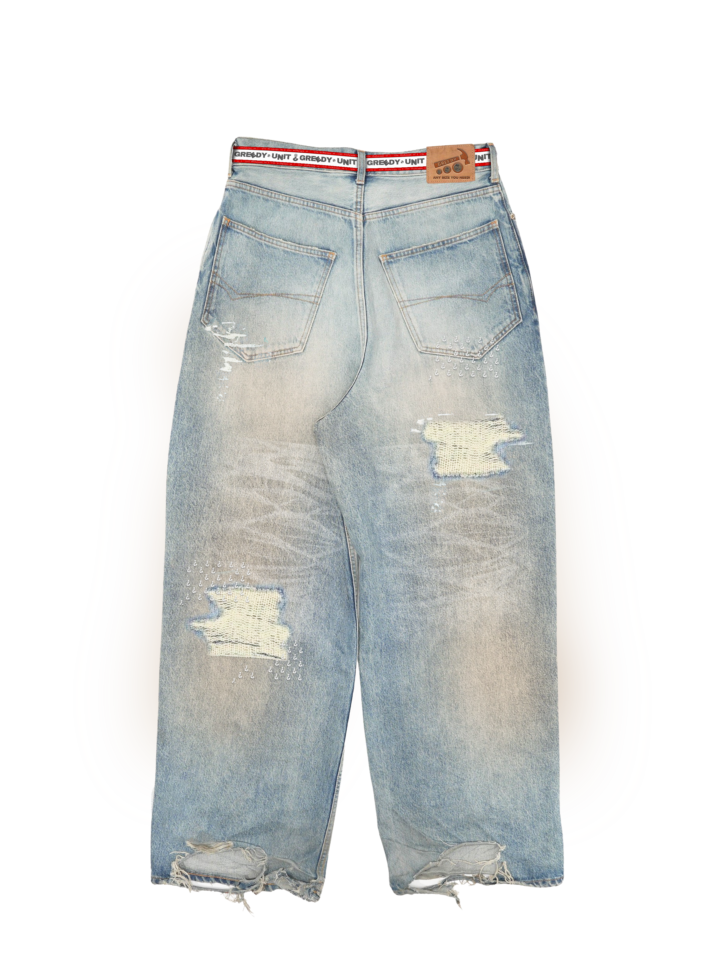
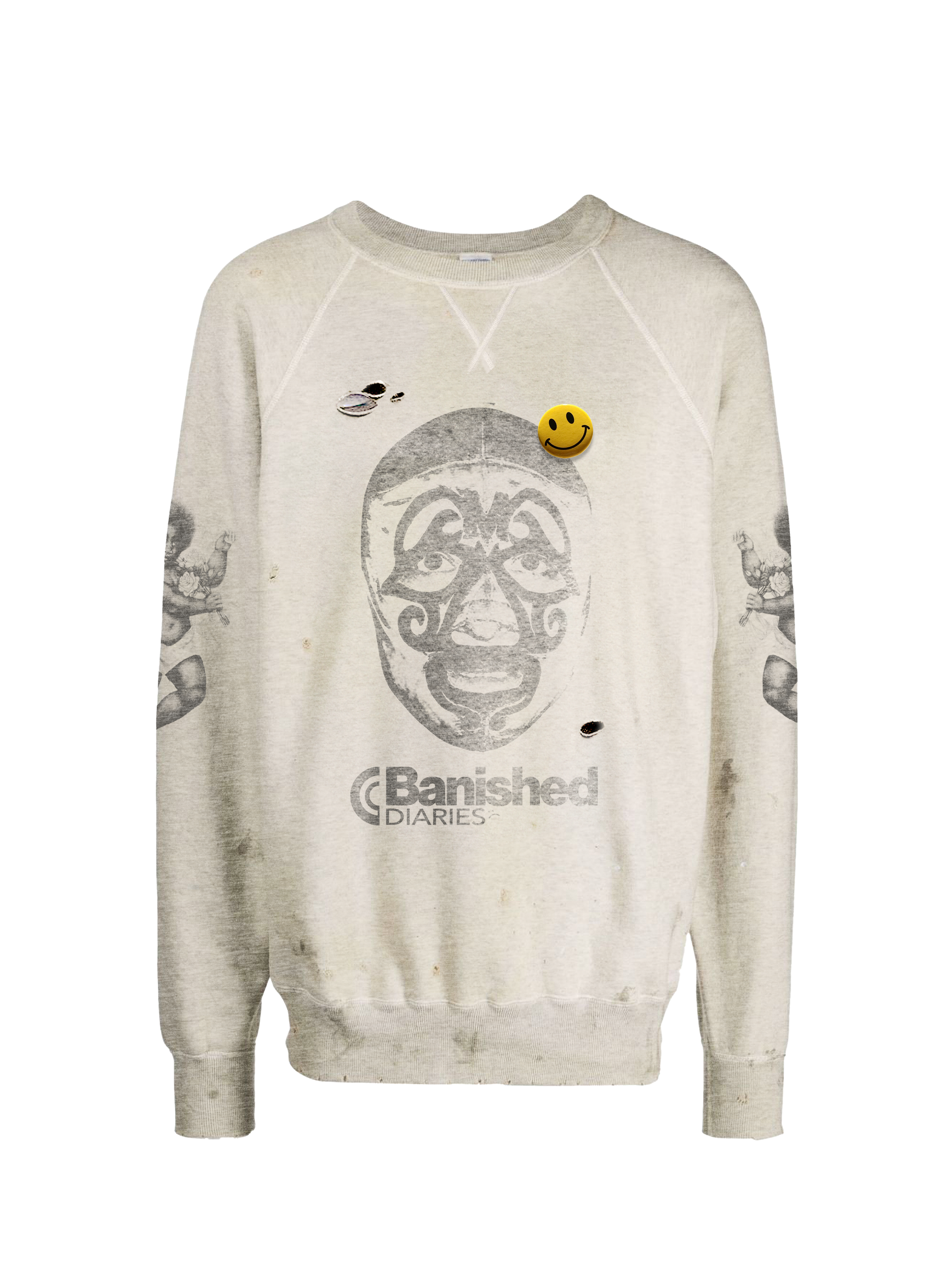
Pieces come to Life
Real pieces that were actually made. Kept separate from mockups so the work reads immediately and the brand names can stand on their own.
Applied Concepts
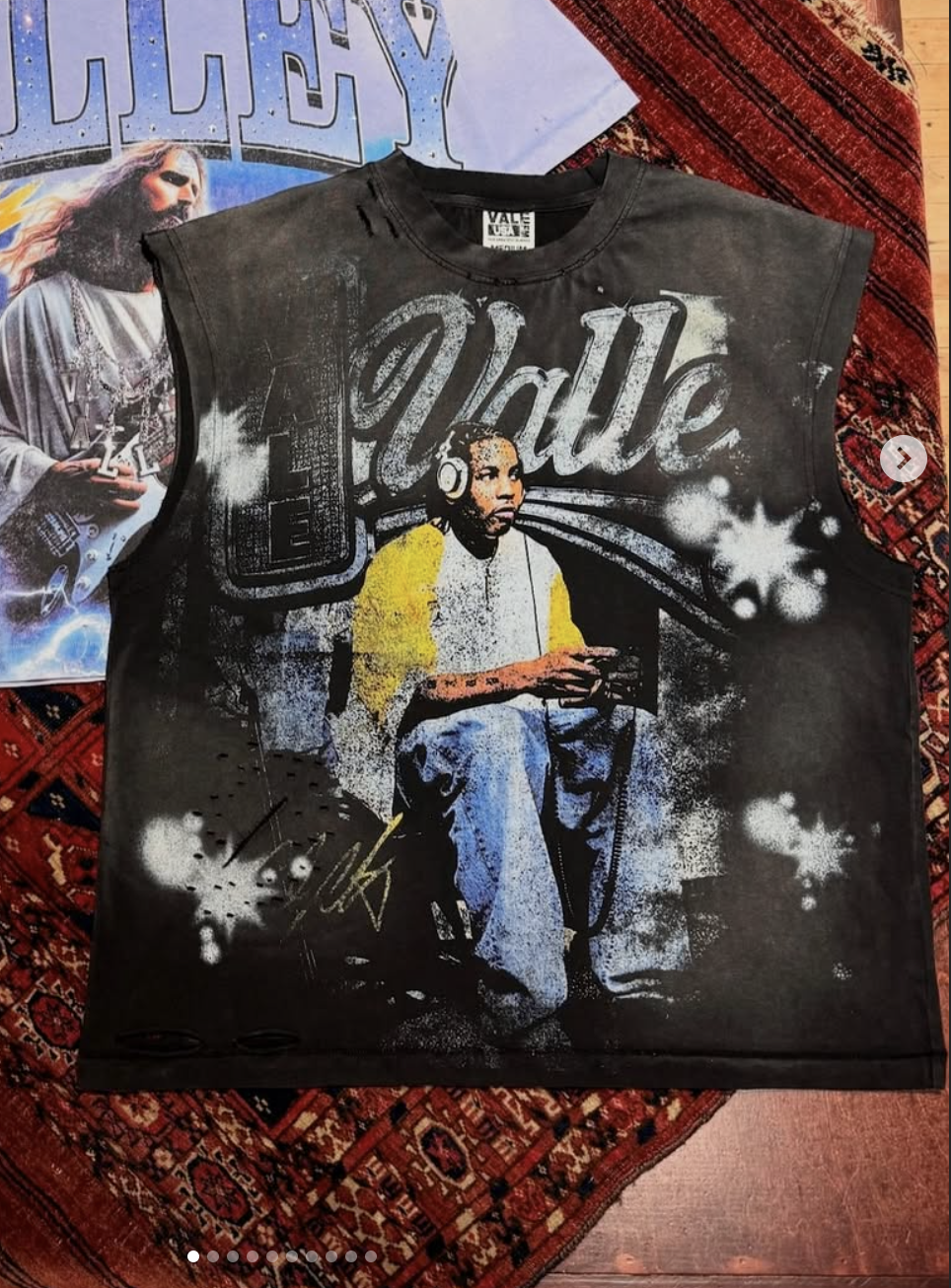
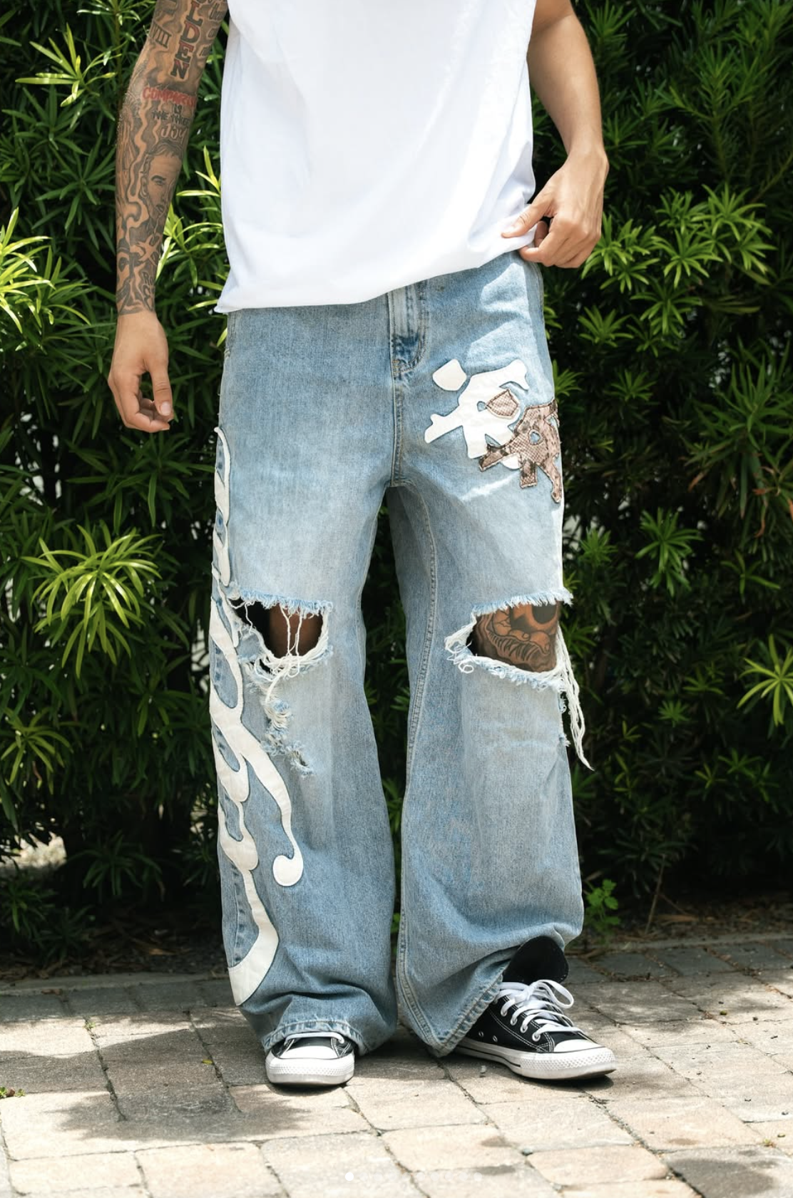
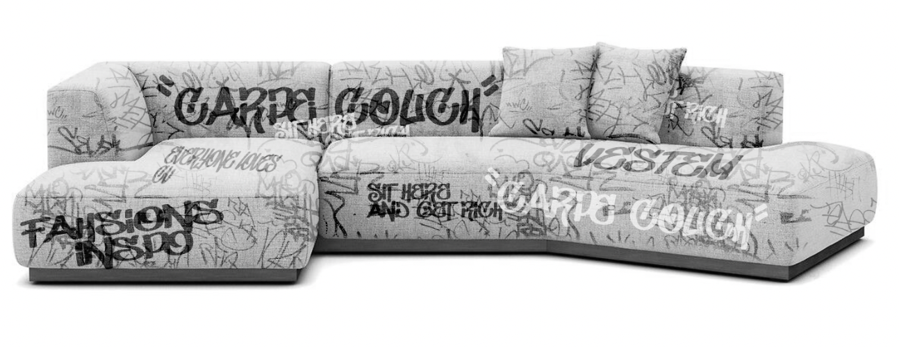
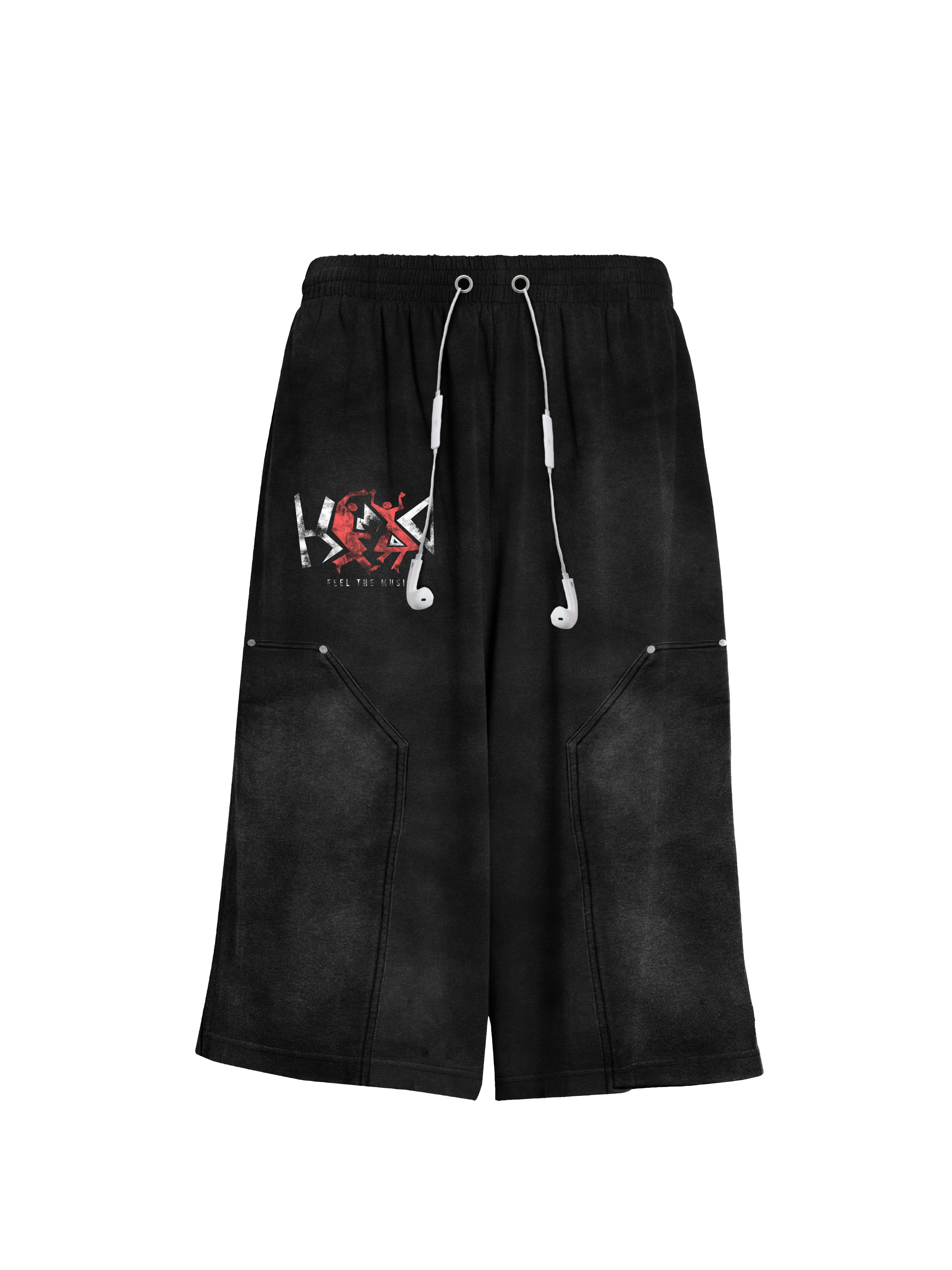
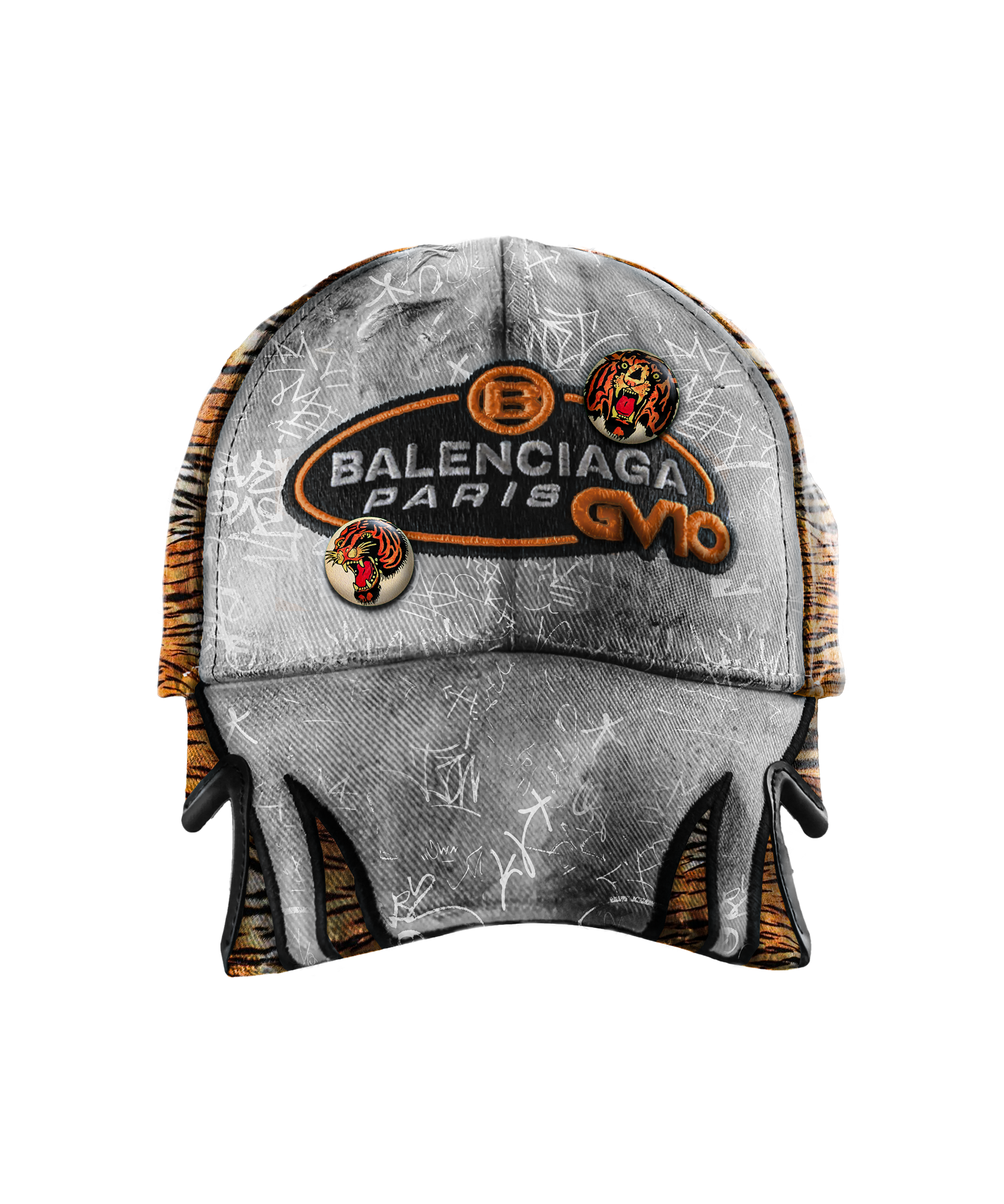
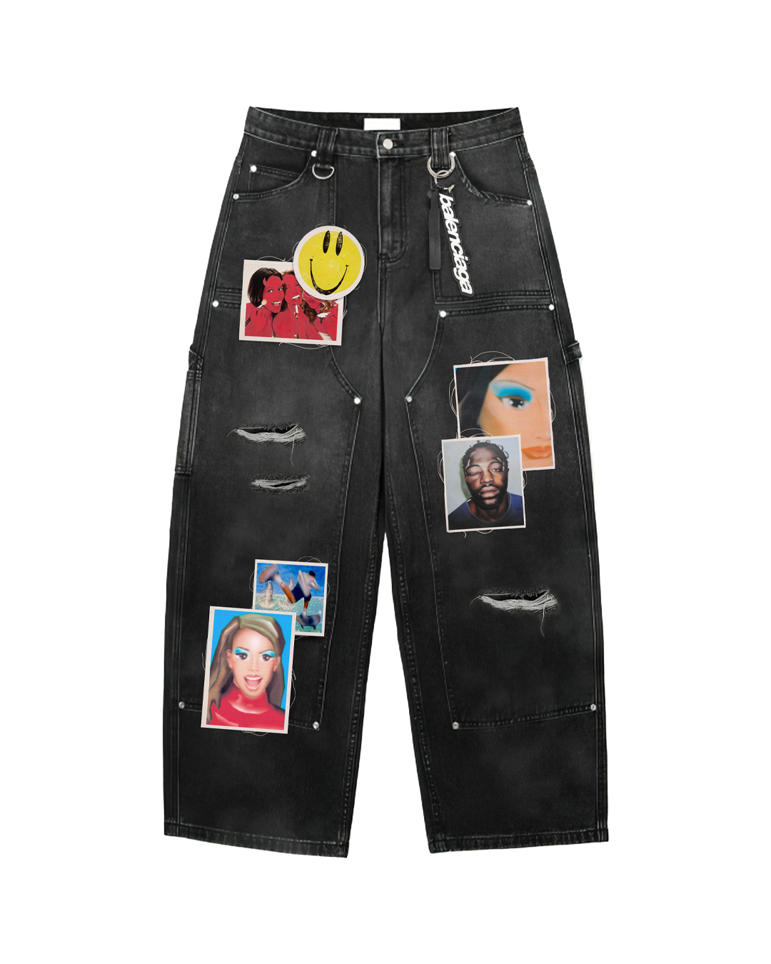
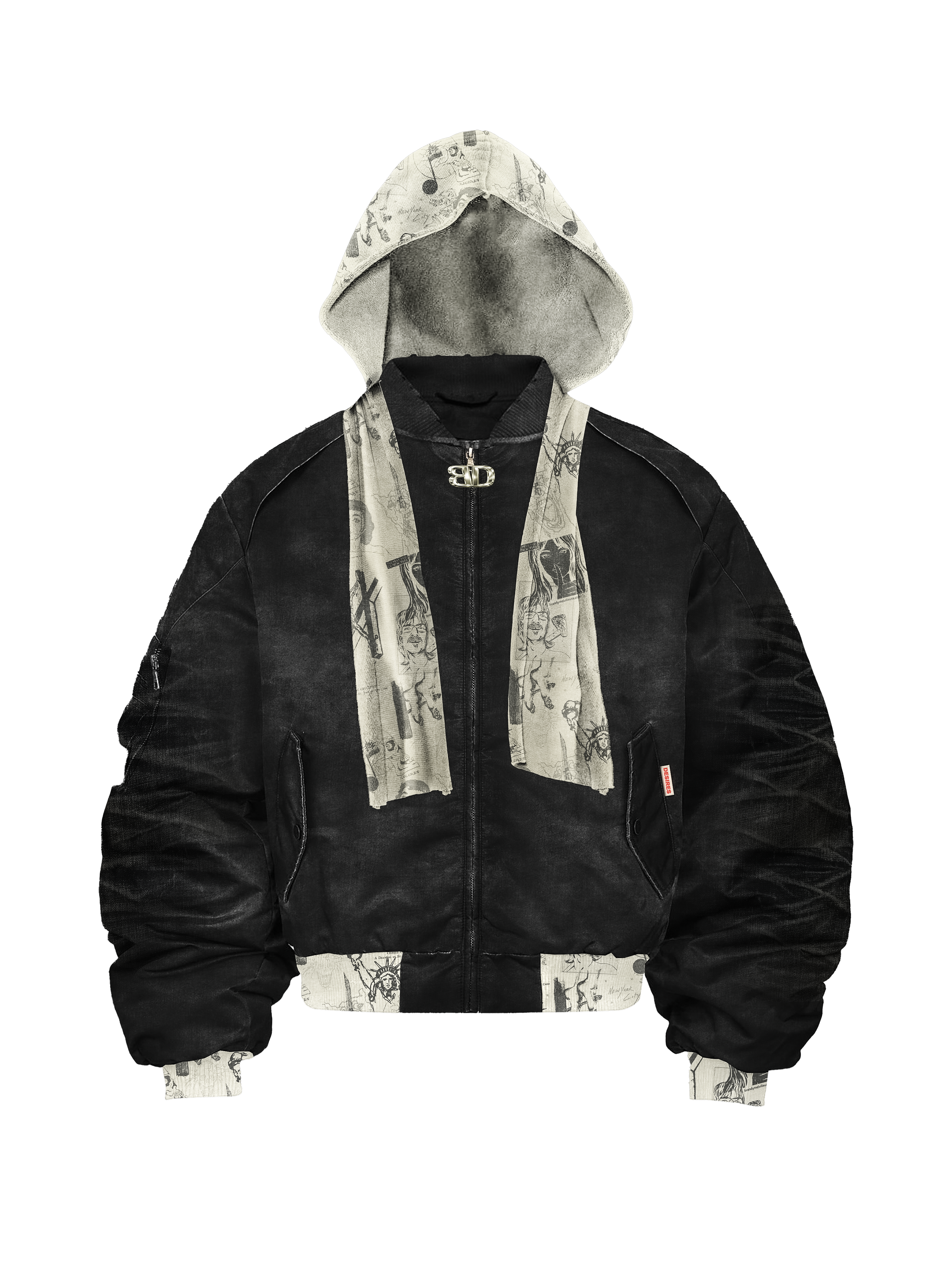
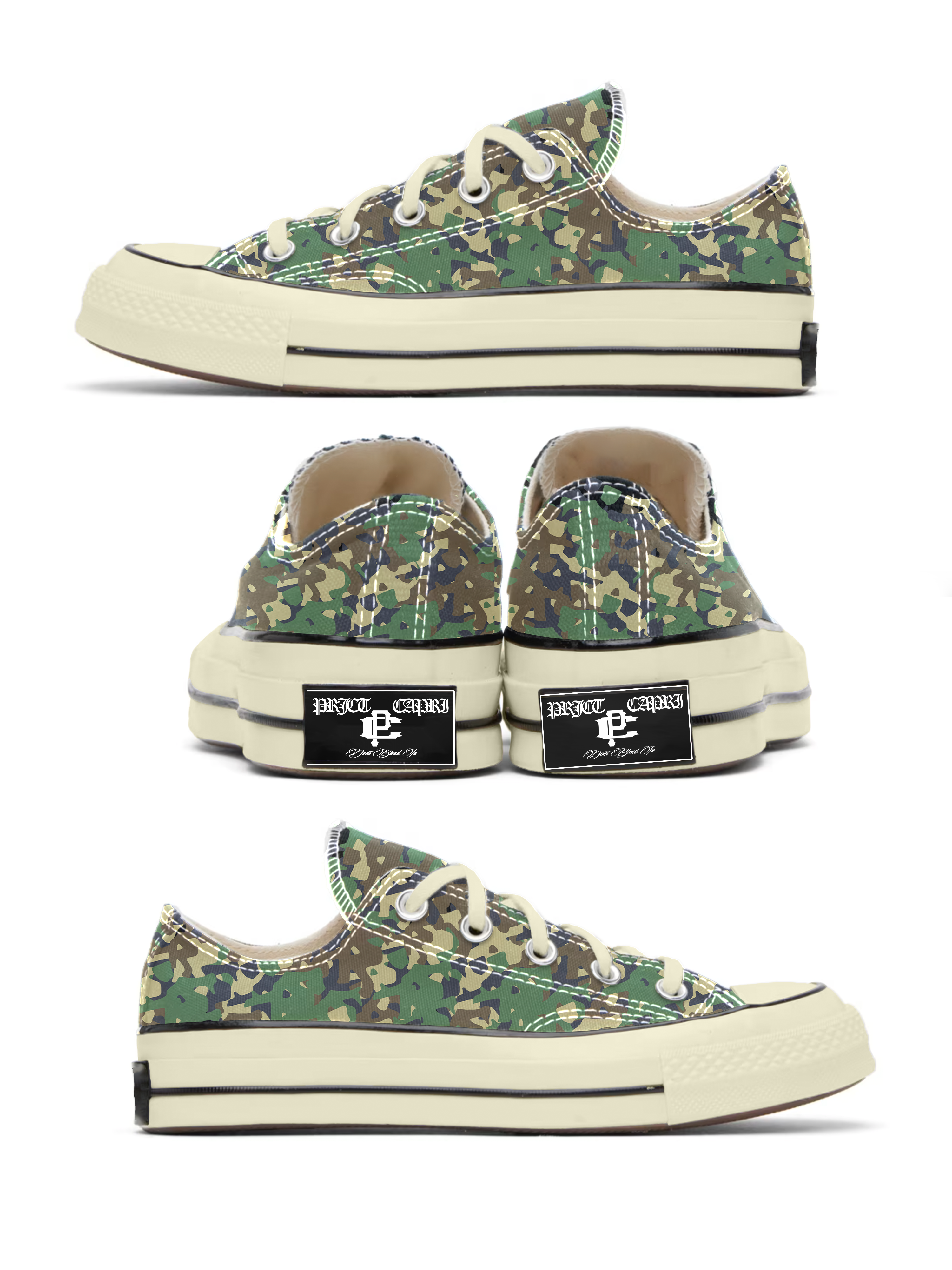
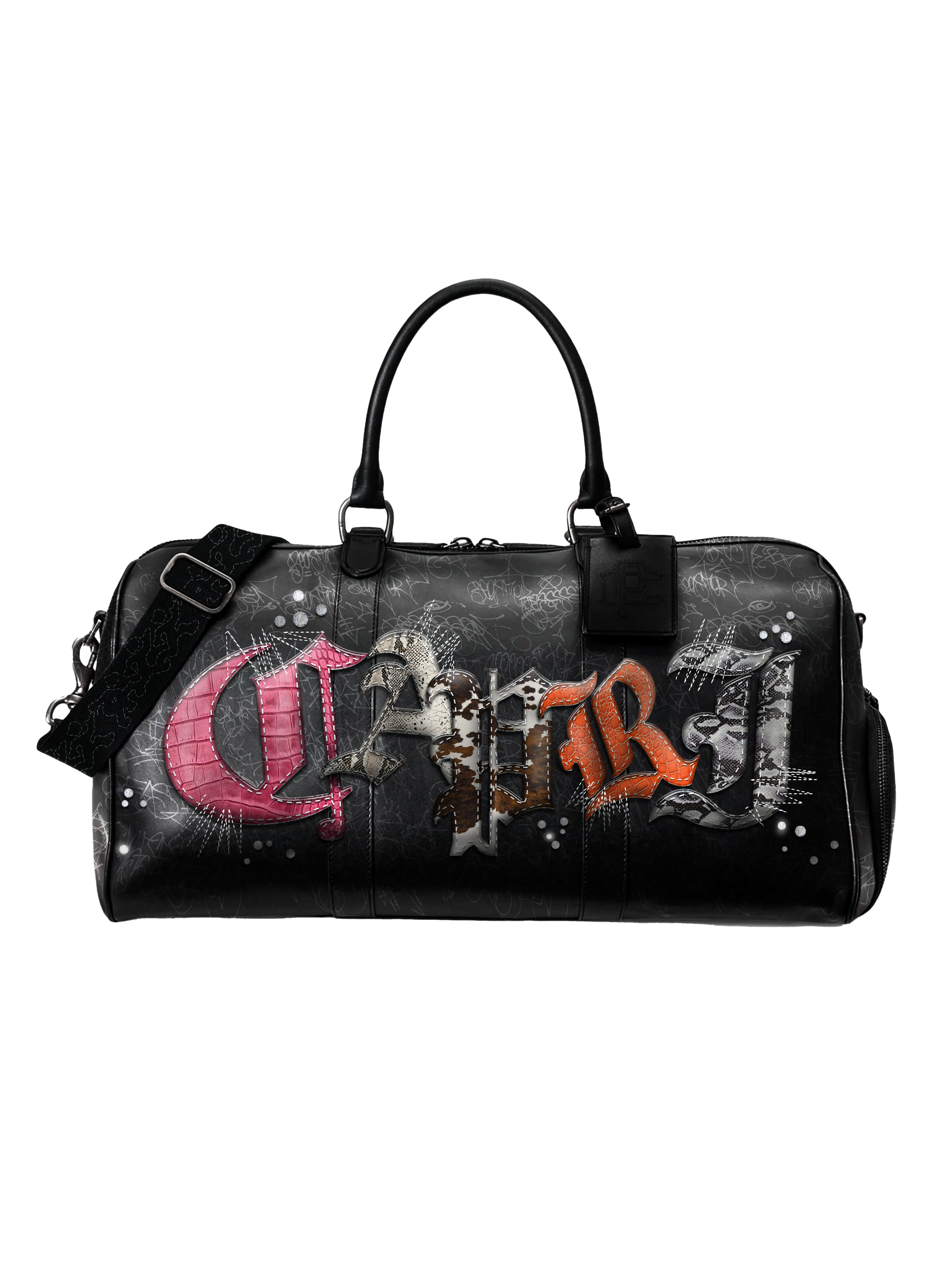
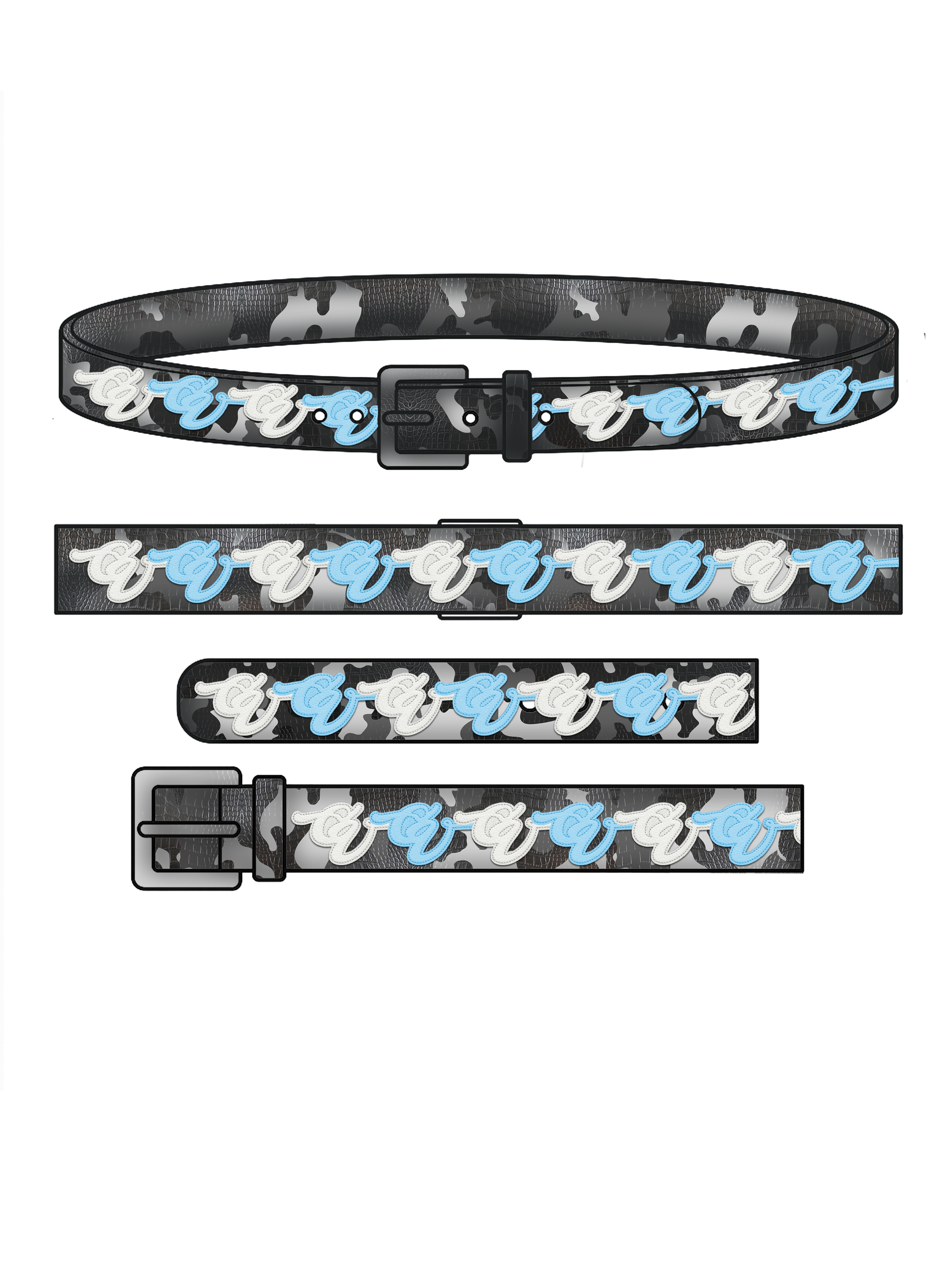
Design Mockups
Mockups only. The clothing is there just to show placement, wash, distressing, and graphic detail more clearly.
Selected Work
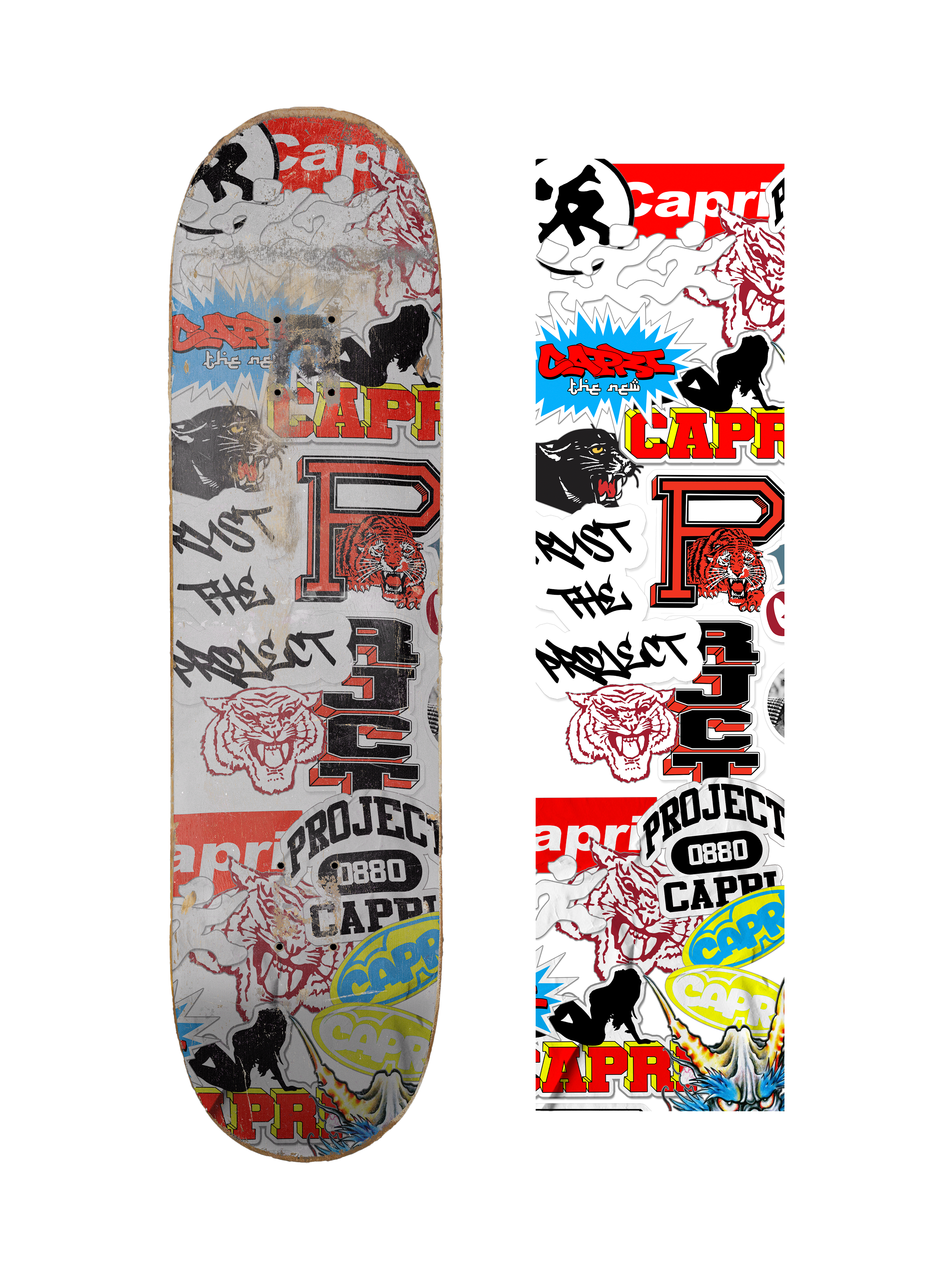
Graphic Archive
Standalone graphics, supporting visuals, and wider design language that shape the world around the garments.

Approach
Clean structure, but with a worn-in feel.
The layout stays clean and direct, but the tone leans more vintage and product-focused: sharper typography, darker neutrals, subtle texture, and enough motion to keep the site feeling alive without getting in the way of the work.